In addition to the more traditional Grid , Row , and Column , Qt Quick also provides a way to layout items using the concept of anchors . Each item can be thought of as having a set of 7 invisible "anchor lines":
- left;
- horizontalCenter;
- right;
- top;
- verticalCenter;
- baseline;
- bottom.
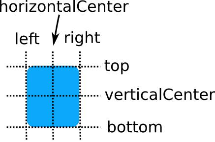
The baseline (not pictured above) corresponds to the imaginary line on which text would sit. For items with no text it is the same as top .
The Qt Quick anchoring system allows you to define relationships between the anchor lines of different items. For example, you can write:
- Rectangle { id: rect1; ... }
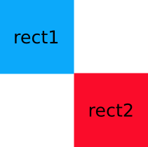
- Rectangle { id: rect2; anchors.left: rect1.right; ... }
In this case, the left edge of rect2 is bound to the right edge of rect1 , producing the following:

You can specify multiple anchors. For example:
- Rectangle { id: rect1; ... }
- Rectangle { id: rect2; anchors.left: rect1.right; anchors.top: rect1.bottom; ... }
By specifying multiple horizontal or vertical anchors you can control the size of an item. Below, rect2 is anchored to the right of rect1 and the left of rect3 . If either of the blue rectangles are moved, rect2 will stretch and shrink as necessary:

There are also some convenience anchors. anchors.fill is a convenience that is the same as setting the left,right,top and bottom anchors to the left,right,top and bottom of the target item. anchors.centerIn is another convenience anchor, and is the same as setting the verticalCenter and horizontalCenter anchors to the verticalCenter and horizontalCenter of the target item.
Anchor Margins and Offsets
The anchoring system also allows margins and offsets to be specified for an item's anchors. Margins specify the amount of empty space to leave to the outside of an item's anchor, while offsets allow positioning to be manipulated using the center anchor lines. An item can specify its anchor margins individually through leftMargin, rightMargin, topMargin and bottomMargin, or use anchors.margins to specify the same margin value for all four edges. Anchor offsets are specified using horizontalCenterOffset, verticalCenterOffset and baselineOffset.
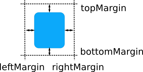
The following example specifies a left margin:
- Rectangle { id: rect1; ... }
- Rectangle { id: rect2; anchors.left: rect1.right; anchors.leftMargin: 5; ... }
In this case, a margin of 5 pixels is reserved to the left of rect2 , producing the following:

Note: Anchor margins only apply to anchors; they are not a generic means of applying margins to an Item. If an anchor margin is specified for an edge but the item is not anchored to any item on that edge, the margin is not applied.
Changing Anchors
Qt Quick provides the AnchorChanges type for specifying the anchors in a state.
- State {
- name: "anchorRight"
- AnchorChanges {
- target: rect2
- anchors.right: parent.right
- anchors.left: undefined //remove the left anchor
- }
- }
AnchorChanges can be animated using the AnchorAnimation type.
- Transition {
- AnchorAnimation {} //animates any AnchorChanges in the corresponding state change
- }
Anchors can also be changed imperatively within JavaScript. However, these changes should be carefully ordered, or they may produce unexpected outcomes. The following example illustrates the issue:
- //bad code
- Rectangle {
- width: 50
- anchors.left: parent.left
- function reanchorToRight() {
- anchors.right = parent.right
- anchors.left = undefined
- }
- }
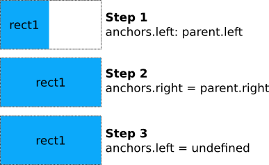
When
is called, the function first sets the right anchor. At that point, both left and right anchors are set, and the item will be stretched horizontally to fill its parent. When the left anchor is unset, the new width will remain. Thus when updating anchors within JavaScript, you should first unset any anchors that are no longer required, and only then set any new anchors that are required, as shown below:
- reanchorToRight
- Rectangle {
- width: 50
- anchors.left: parent.left
- function reanchorToRight() {
- anchors.left = undefined
- anchors.right = parent.right
- }
- }
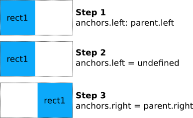
Because the evaluation order of bindings is not defined, it is not recommended to change anchors via conditional bindings, as this can lead to the ordering issue described above. In the following example the Rectangle will eventually grow to the full width of its parent, because both left and right anchors will be simultaneously set during binding update.
- //bad code
- Rectangle {
- width: 50; height: 50
- anchors.left: state == "right" ? undefined : parent.left;
- anchors.right: state == "right" ? parent.right : undefined;
- }
This should be rewritten to use AnchorChanges instead, as AnchorChanges will automatically handle ordering issues internally.
Restrictions
For performance reasons, you can only anchor an item to its siblings and direct parent. For example, the following anchor is invalid and would produce a warning:
- //bad code
- Item {
- id: group1
- Rectangle { id: rect1; ... }
- }
- Item {
- id: group2
- Rectangle { id: rect2; anchors.left: rect1.right; ... } // invalid anchor!
- }
Also, anchor-based layouts cannot be mixed with absolute positioning. If an item specifies its x position and also sets anchors.left, or anchors its left and right edges but additionally sets a width, the result is undefined, as it would not be clear whether the item should use anchoring or absolute positioning. The same can be said for setting an item's y and height with anchors.top and anchors.bottom, or setting anchors.fill as well as width or height. The same applies when using positioners such as Row and Grid, which may set the item's x and y properties. If you wish to change from using anchor-based to absolute positioning, you can clear an anchor value by setting it to
.
- undefined
