Once we made customized buttons in the previous lesson , it is time to make the Custom Dialog, which will look more natively for Android devices, and can even look like the design on the IOS device. In any case, you will be able to more fully come to the realization of these devices guides.
To create a dialog object to be used Dialog of QtQuick.Dialog library. Nuance of A when working with custom dialog for Android is that the Standard Buttons that adequately look at the development of a desktop, for they look bad for Android, and more difficult to customize them for a beginner developer. The easiest way to implement your own buttons with their own stylization.
Development of Custom Dialog
Development of customized dialogue will continue on the basis of the project from the previous lesson. There we have two Custom Button have been created that we have a little tweak in color, so they looked concisely in relation to the dialogue. Also, using the technique in their styling, Styling dialog box button, which will be two buttons: "OK" and "Cancel". These buttons will close the dialog.
Dialog buttons will need to arrive at the bottom of the dialog, and the rest give a message "Hello, World !!!", as well as the section's button gray line with each other, and the same line will separate the buttons on the message. It will seem a bit on the IOS dialogue. As the line will be the Rectangle rectangle, the same technique is applied in the development of Android on Java, but instead of QML uses XML layout.
In order to make a customized normal contents of the dialog box, you must specify its parameter contentItem the object that will replace the contents. The most convenient is the Rectangle object, as early as it will place all other objects. Naturally no standard buttons there already and will not be in sight, so you can forget about them, but it is not a great loss indeed.
main.qml
All work will be carried out only in main.qml file, so just bring it. The rest of the information can see in the previous article .
- import QtQuick 2.5
- import QtQuick.Controls 1.4
- import QtQuick.Controls.Styles 1.4
- import QtQuick.Dialogs 1.2
- import QtQuick.Layouts 1.1
- ApplicationWindow {
- visible: true
- width: 640
- height: 480
- title: qsTr("Hello World")
- color: "white"
- MainForm {
- // Stretch the object of the main window over the parent element
- anchors.fill: parent
- // Styling the first button
- button1.style: ButtonStyle {
- // Styling the appearance of button
- background: Rectangle {
- /* If the button is pressed, it will be red
- * with a black bezel with rounded edges,
- * otherwise it will be black with a red rim
- */
- color: control.pressed ? "#d7d7d7" : "#f7f7f7"
- border.color: "#d7d7d7"
- border.width: 2
- radius: 5
- }
- // Styling the button text color
- label: Text {
- /* If the button is pressed, the color will be black
- * Otherwise red
- */
- text: qsTr("Press Me 1")
- color: "black"
- }
- }
- // Styling second button
- button2.style: ButtonStyle {
- // Styling the appearance of buttons
- background: Rectangle {
- /* similarly as for the first button,
- * But in the reverse order
- */
- color: control.pressed ? "#d7d7d7" : "#f7f7f7"
- border.color: "#d7d7d7"
- border.width: 2
- radius: 5
- }
- // Styling button color
- label: Text {
- /* similarly as for the first button,
- * But in the reverse order
- */
- text: qsTr("Press Me 2")
- color: "black"
- }
- }
- // Start a dialogue by pressing any of the buttons in the main window
- button1.onClicked: dialogAndroid.open();
- button2.onClicked: dialogAndroid.open();
- // Create Object dialog box
- Dialog {
- id: dialogAndroid
- /* When deploite for Android-devices,
- * obligatory comment out these two lines,
- * another word glitches in the operation of the device
- */
- width: 600 // Set the width of the dialog, which works on the desktop, but it does not work on Android
- height: 500 // Set the height of the dialog, which works on the dekstop, but does not work on Android
- // Create the contents of the dialog box
- contentItem: Rectangle {
- width: 600 // Set the width, necessary for Android-devices
- height: 500 // Set the height, necessary for Android-devices
- color: "#f7f7f7" // Set the color
- // The area for the dialog box message
- Rectangle {
- anchors.left: parent.left
- anchors.right: parent.right
- anchors.top: parent.top
- anchors.bottom: dividerHorizontal.top
- color: "#f7f7f7" // Задаём цвет области
- Label {
- id: textLabel
- text: qsTr("Hello, World!!!")
- color: "#34aadc"
- anchors.centerIn: parent
- }
- }
- // Create a horizontal divider with the Rectangle
- Rectangle {
- id: dividerHorizontal
- color: "#d7d7d7"
- height: 2
- anchors.left: parent.left
- anchors.right: parent.right
- anchors.bottom: row.top
- }
- /* Create a support for an object in the form of rows of buttons
- * this facility for children objects do not work some parameters of
- * anchors, except anchors.top parameters and anchors.bottom
- */
- Row {
- id: row
- height: 100 // Set height
- anchors.bottom: parent.bottom
- anchors.left: parent.left
- anchors.right: parent.right
- Button {
- id: dialogButtonCancel
- anchors.top: parent.top
- anchors.bottom: parent.bottom
- // Set width button halfway line minus 1 pixel
- width: parent.width / 2 - 1
- style: ButtonStyle {
- background: Rectangle {
- color: control.pressed ? "#d7d7d7" : "#f7f7f7"
- border.width: 0
- }
- label: Text {
- text: qsTr("Cancel")
- color: "#34aadc"
- verticalAlignment: Text.AlignVCenter
- horizontalAlignment: Text.AlignHCenter
- }
- }
- onClicked: dialogAndroid.close()
- }
- Rectangle {
- id: dividerVertical
- width: 2
- anchors.top: parent.top
- anchors.bottom: parent.bottom
- color: "#d7d7d7" // Задаём цвет разделителя
- }
- Button {
- id: dialogButtonOk
- anchors.top: parent.top
- anchors.bottom: parent.bottom
- width: parent.width / 2 - 1
- // Стилизуем кнопку
- style: ButtonStyle {
- background: Rectangle {
- color: control.pressed ? "#d7d7d7" : "#f7f7f7"
- border.width: 0
- }
- label: Text {
- text: qsTr("Ok")
- color: "#34aadc"
- verticalAlignment: Text.AlignVCenter
- horizontalAlignment: Text.AlignHCenter
- }
- }
- onClicked: dialogAndroid.close()
- }
- }
- }
- }
- }
- }
Result
As a result, you get Custom Dialog, which already will look decent on your Android device. Of course, under the dekstopov it will look awful, at least in this tutorial, but it is a question of the correct scaling size and configuration elements that are the issue of a separate article.
And here is the result of dialogue on my smartphone and the desktop you can see in the screenshots and in the video tutorial.
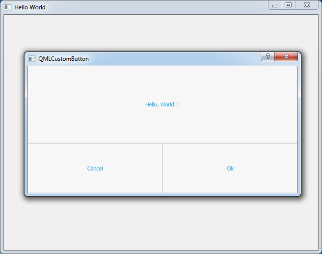
QML Custom Dialog Desctop
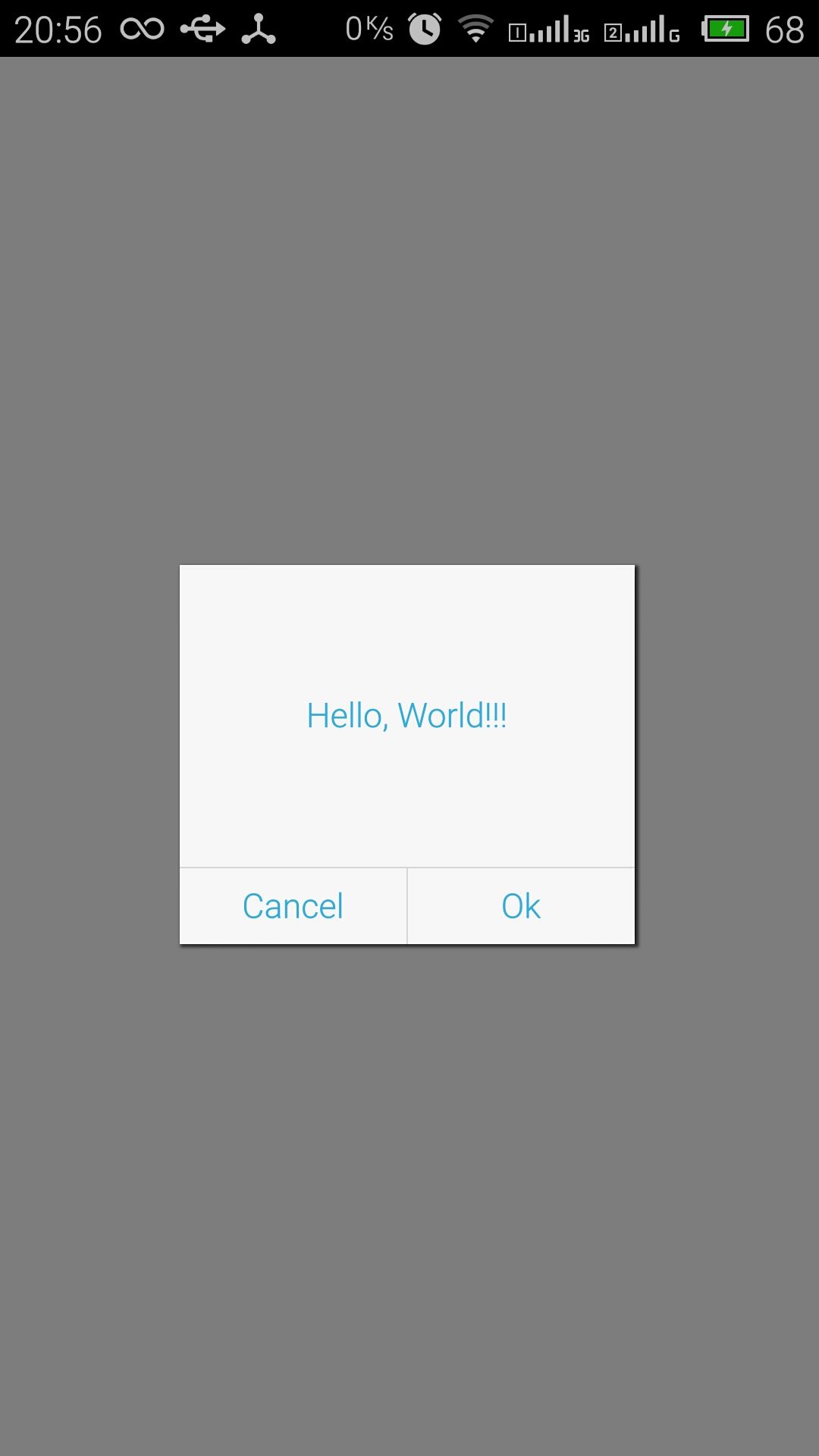
QML Custom Dialog Android
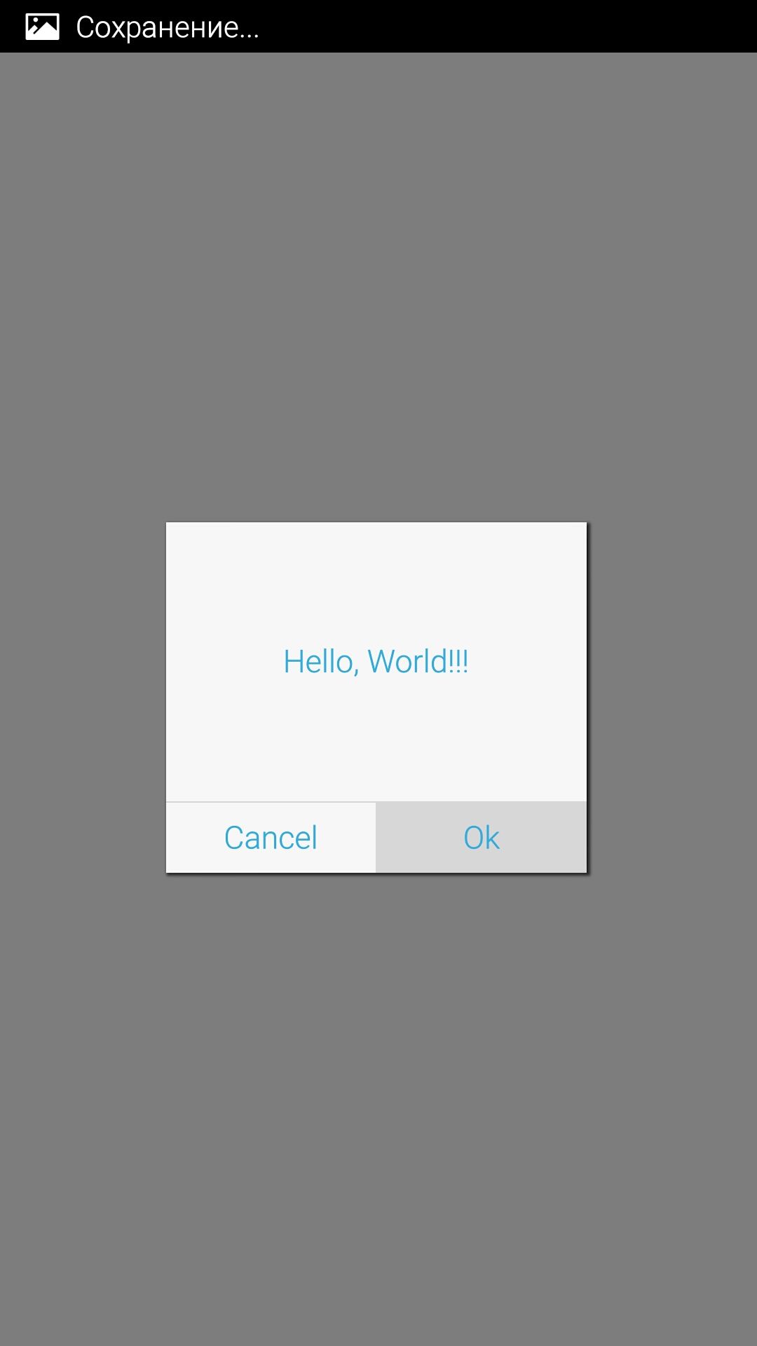
QML Custom Dialog Android

Немного не понял
Заполнение Row происходит слава направо?
Сначала устанавливаем ButtonCancel потом Вертикальный разделитель и следом ButtonOk
Ну да. Вас смущает последовательность? Можете и наоборот заполнить.
Это из разряда какой вариант юзабилити может быть удобнее. Начитался всяких гайдлайнов от Google да Apple, вот так и написал. А так дело вашего вкуса.